Read the CRM dashboard
Eight charts covering where your leads are, where they came from, when they arrive and how fast you answer them.
The dashboard answers the questions you cannot answer by scrolling a list: is the pipeline healthy, where do leads come from, and how long do people wait for a reply.
CRMDashboard
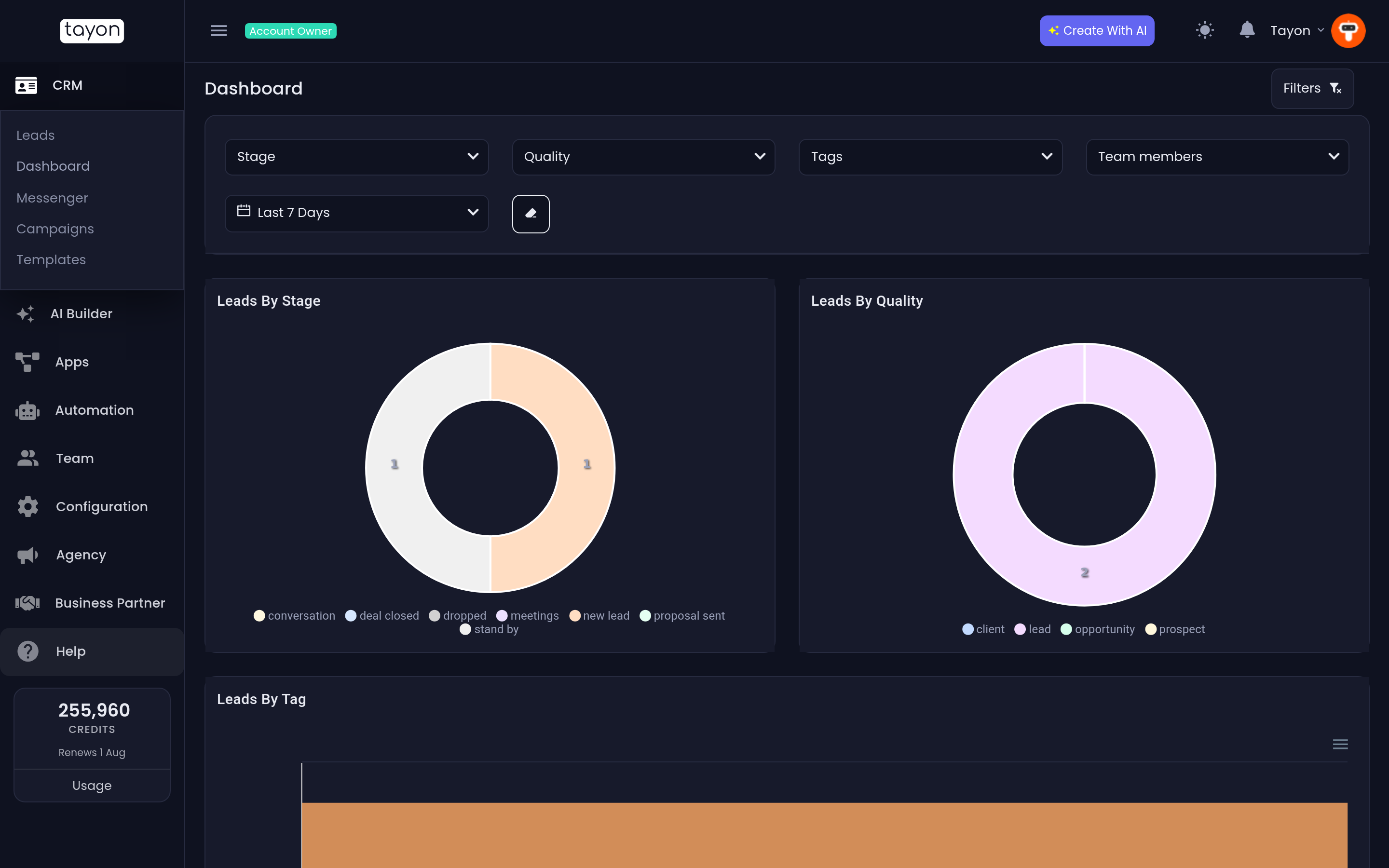
#Set the period first
Every chart on this screen obeys the same period. The date dropdown offers Today, Yesterday, Last 3 Days, Last 7 Days, This Week, This Month, Last Month, This Year, Last Year and Custom. Last 7 Days is the starting point.
Custom reveals a Registration date range picker.
#The other filters
Filters opens the same set as the Leads list: Stage, Quality, tags and Team members. They apply to every chart at once, so the dashboard can be narrowed to one person, one product tag or one stage without leaving the page.
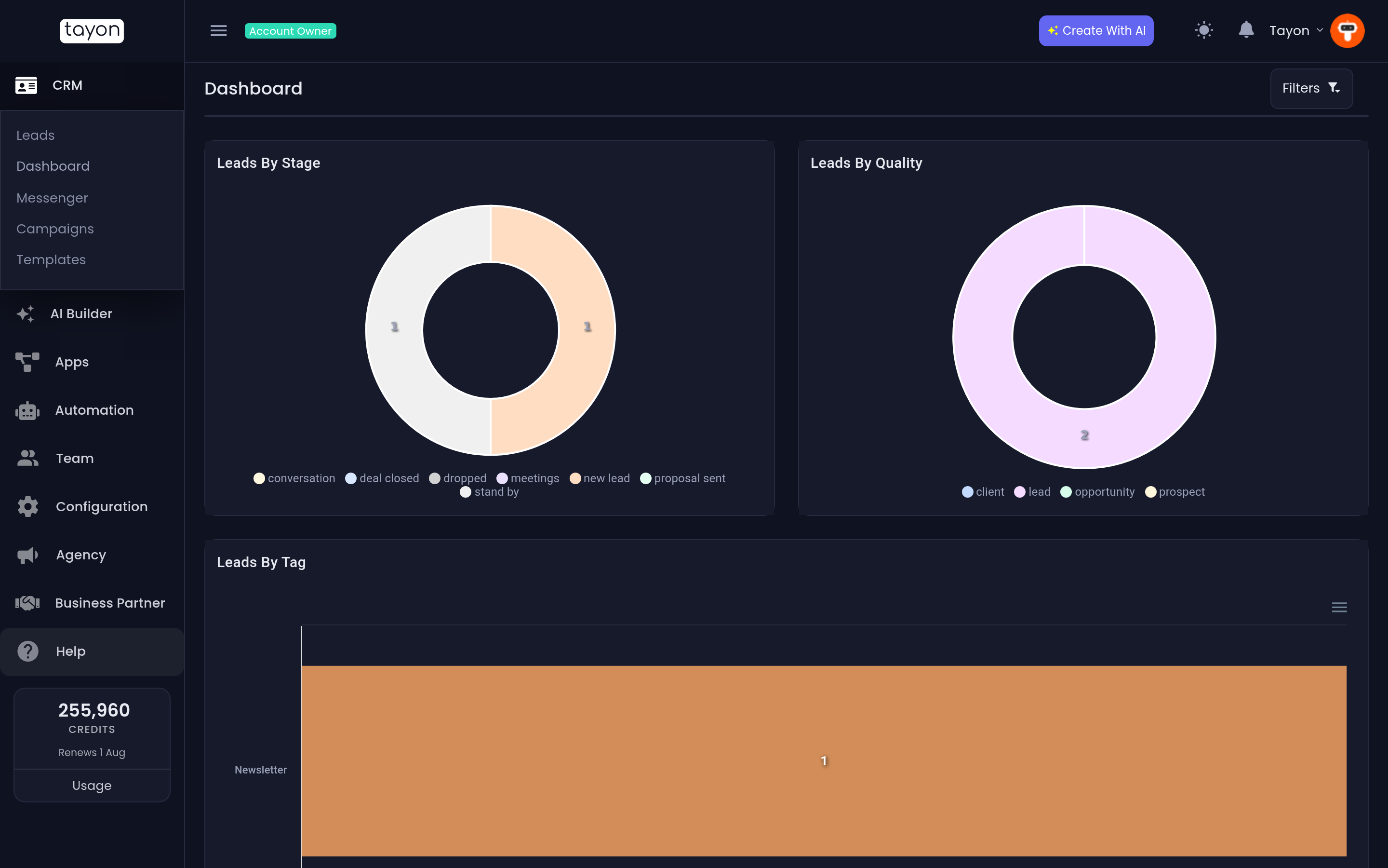
Clear Filters resets them; each dropdown also has its own Clean.
#The charts
#Leads by Stage
A doughnut showing how your leads are spread across the pipeline. A pipeline that bulges in the middle is stalling; one that bulges at the front means you are collecting leads faster than you are working them.
#Leads by Quality
The same shape, by quality. If almost everything is your best quality, your qualities are not doing any work.
#Leads by Tag
A bar per tag. This is where you read the answer to “which of our campaigns actually brought people in” — provided you tag consistently.
#Leads by Period
A line of new leads over time, with Day, Week and Month buttons to change the grain. The chart zooms, so you can pull in on a spike and see what week it was.
#Leads by Hour of Day
New leads by hour, 0 to 23. Read it as a staffing chart: it tells you the hours when someone should be watching the inbox.
#Messages Received and Messages Sent
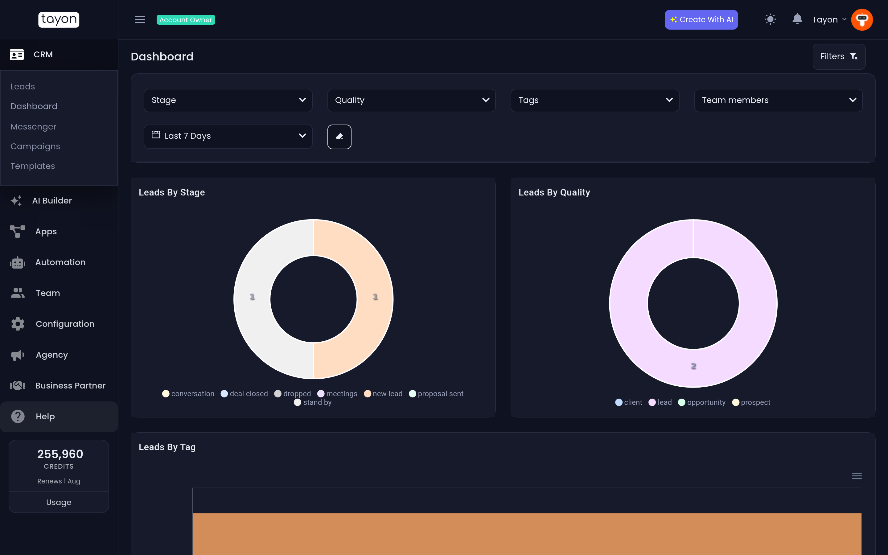
Two bar charts, split by channel — email, SMS and WhatsApp — for the period. Put side by side they show whether conversations are balanced or whether one side is doing all the talking.
#Average Response Time
How long, in hours, between an inbound message and your reply, split by channel. Two buttons decide what counts:
- Resolved only — measures only conversations that were ended. The number under the title reads N chats resolved.
- All intervals — measures every reply, whether or not the conversation closed. The number reads N intervals.
Resolved only is the more honest measure of how long a customer waits from start to finish. All intervals is the better day-to-day operational number, because it includes conversations still running.
#Reading it well
Change one filter at a time. The charts are all driven by the same underlying set, so narrowing to a single team member re-draws all eight at once, and it is easy to lose track of why a number moved.
Compare like with like: This Month against Last Month tells you something. Last 7 Days against This Year tells you nothing.
Updated: