Theme and brand your site
Set the logo, colours, fonts and footer once, apply them to every screen, and override them on the screens that need to look different.
A conversational form should look like it belongs to you, not to Tayon. The branding you set applies to the whole site at once, and you can override it on individual screens where you want something different.
All of it lives behind Settings in the Flow Designer header.
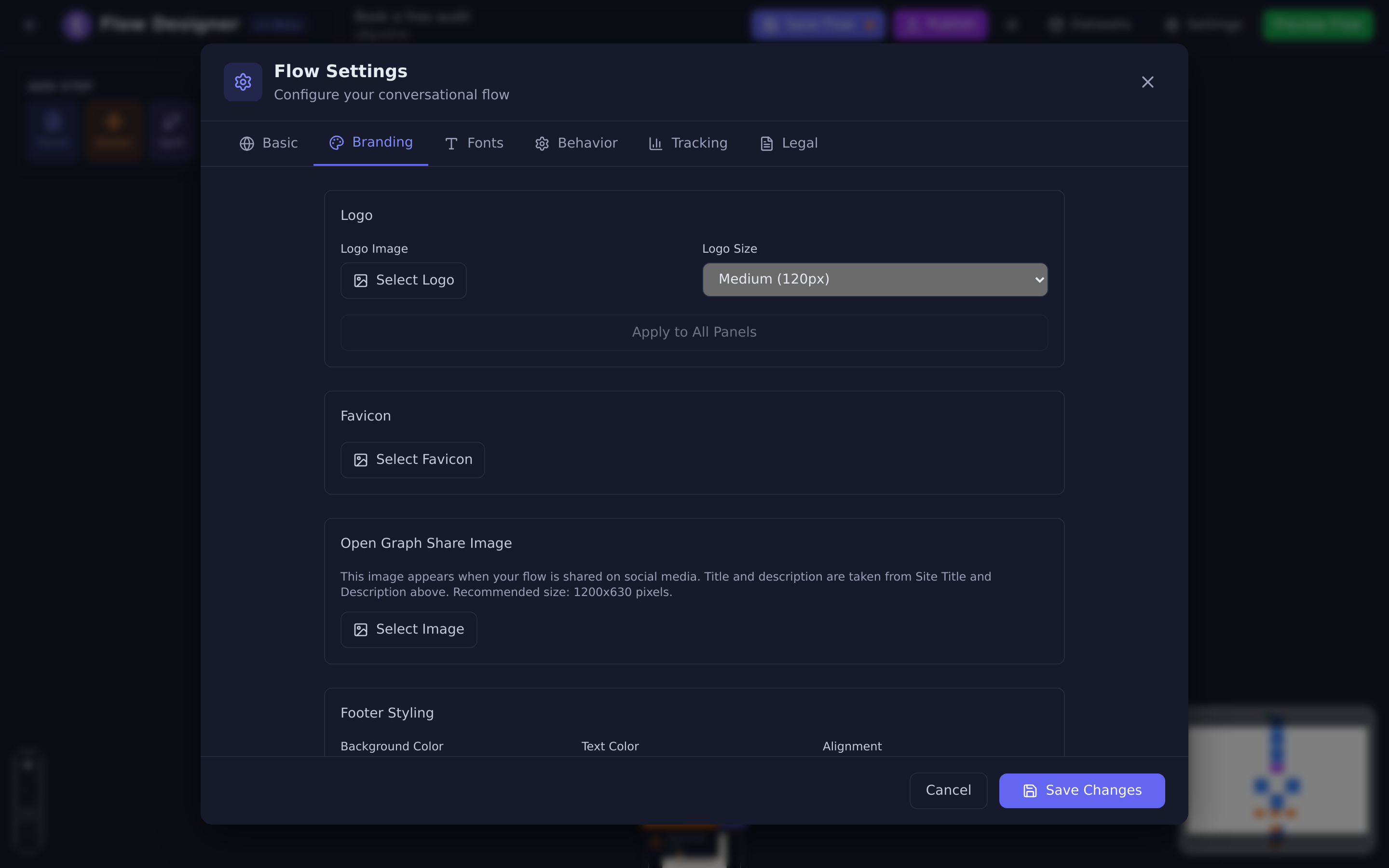
#Set it once, apply it everywhere
The Branding tab has two Apply to All Panels buttons — one under the logo, one under the colours. This is the part people miss.
Changing a colour in Branding sets the default for new screens. It does not touch the screens that already exist. Apply to All Panels is what pushes the change across every screen you have already built.
- Open Settings in the designer header.
- Go to Branding.
- Set your logo and colours.
- Choose Apply to All Panels under each section you changed.
- Save Changes, then Publish.
#What you can set
#Logo, favicon and share image
| Setting | What it is for |
|---|---|
| Logo | Shown on the screens. Sizes offered are Small (80px), Medium (120px), Large (160px) and Extra Large (200px). |
| Favicon | The small icon in the browser tab. |
| Open Graph Share Image | The picture that appears when someone pastes your link into a chat or a social post. Recommended size 1200 × 630 pixels. The title and description beside it come from Site Title and Description on the Basic tab. |
#Colours
Seven colours cover the whole site:
- Panel Background
- Title Color
- Subtitle Color
- Text Color
- Button Background
- Button Text Color
- Option Button Label Color — the label and outline on choice buttons. Their background follows Button Background.
#Fonts
Five slots, each with its own font family and size: Title, Subtitle, Paragraph, Button and Interaction (the text people type into). Each one previews in its actual typeface as you choose it, so you can see the pairing before you commit.
Sizes run from Extra Small through to 2x Large.
#Progress indicator
Turn on Show progress indicator and pick a style:
| Style | What visitors see |
|---|---|
| Progress Bar | A horizontal bar that fills up. |
| Dots | One dot per step. |
| Step Counter | The words Step 3 of 8. |
You also choose its Position — Top or Bottom — and its colour. A preview updates as you change it.
#Footer
Set the footer’s background colour, text colour and alignment (Left, Center or Right), and the Copyright Text that sits in it.
Individual screens can hide the footer — that switch is on the screen itself, under Settings in its properties, not here.
#Legal documents
The Legal tab links a Terms of Service, a Privacy Policy and a Disclaimer to the site. You write the documents elsewhere in Tayon and just select them here; they appear as links in the footer automatically.
#Override the branding on one screen
Site-wide settings are defaults. Any screen can look different:
- Open the screen and go to its Colors tab to change that screen’s colours only.
- Use its Images tab to set images that belong to that screen.
A closing “thank you” screen with an inverted background is the usual reason to do this. See The panel properties tabs.
#Remember to publish
Branding changes follow the same rule as everything else: Save Changes stores them, Publish puts them in front of visitors. Check the live page afterwards with Show page on the sites list.
Updated: